


Hi, I'm Charley!
I'm a graphic designer with a strong love for motion design and illustration. I love fun, outside-of-the-box solutions to design challenges, all things typography, and emphasizing accessibility within design.
When I'm not designing, you can find me doodling with a cup of coffee and rambling on about my love for finch birds.
Feel free to check out my Instagram, YouTube, or connect with me via email at [email protected].


Final Videos
Timeframe
4 weeks
Roles
Packaging designer, illustrator, motion designer
Tools
Adobe Illustrator, Adobe InDesign, Adobe After Effects, Adobe Photoshop, Procreate
Overview
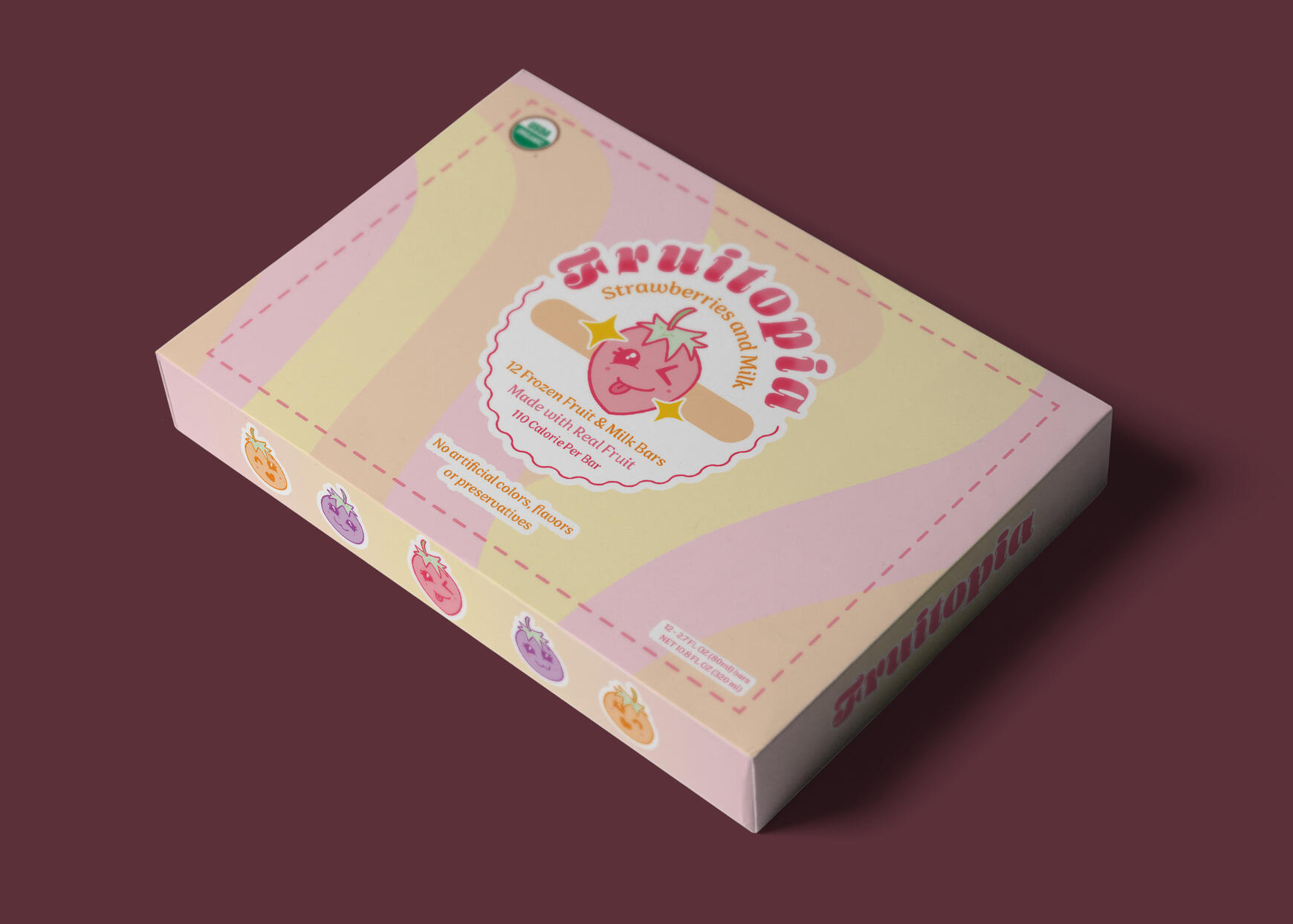
Fruitopia is long-standing company that is undergoing a massive rebranding. Founded in 1950, Fruitopia once made all kind of food products, from hotdog buns to cotton candy, but since a new CEO took over in 2012, they have downsized to making a small line of healthy, eco-friendly frozen fruit bars.
Problem to Solve
Fruitopia wants packaging for their line of frozen fruit bars to reflect the dynamic change in their business.
Solution
I created packaging for a line of Fruitopia's frozen fruit bars which reflects their rebranding and creates excitement for the new direction of business they're headed in. To accompany their packaging and further drive sales, I also created a short video to share on social media to use as marketing.
Creative Brief
Illustration Assets

Strawberry

Blueberry

Orange


Box Design

Front

Back


Final Mockups

Front

Back

Individual Wrapper


Motion Component
Timeframe
12 weeks
Collaborators
Research and discovery group:
Joel Stadtmueller, Justin Bernardy, Daniel Onufer
Roles
Researcher, visual designer, environmental graphics, motion designer, copywriter
Tools
Adobe Illustrator, Adobe Indesign, Adobe Photoshop, Adobe After Effects, ProCreate
Overview
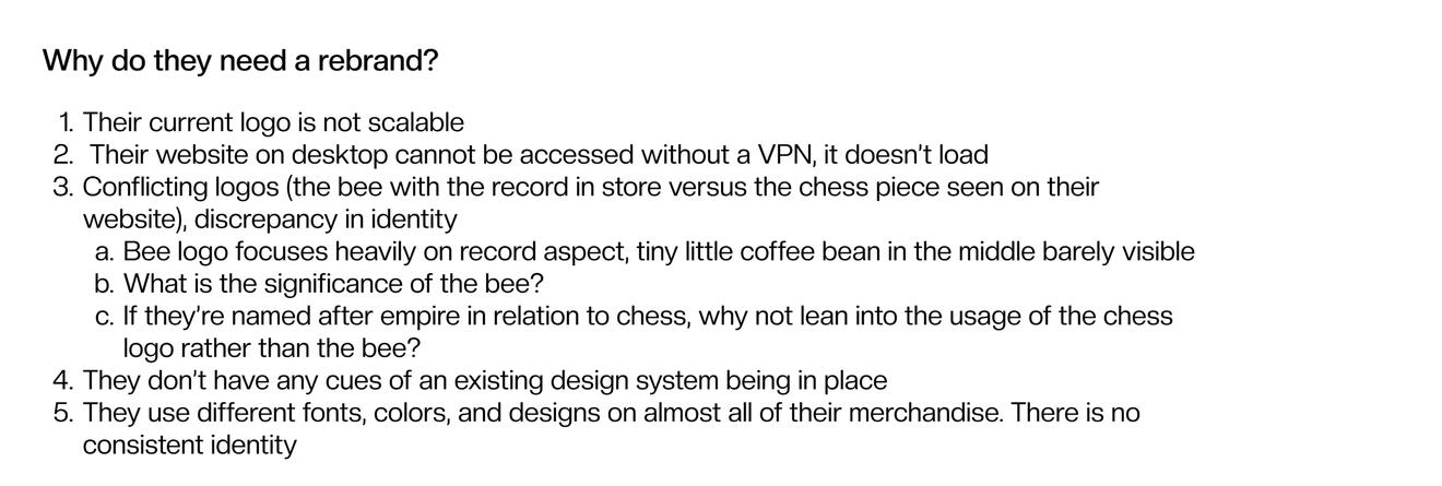
Empire Roasters & Records is a pillar in Columbia City neighborhood for music lovers and café enthusiasts alike. They create a space for the community to gather and enjoy coffee, food, and music,. Empire Roasters & Records’s key values are being community driven, authentic, and curated.
Problem to Solve
The branding is inconsistent as you experience the roasters versus the records parts of the brand.
Solution
I created a cohesive, welcoming brand using candid imagery, warm and welcoming colors, and hand-drawn elements. The solution for their logo design combined the circular nature of espresso beans and vinyl records to craft a recognizable and scalable form across all media.
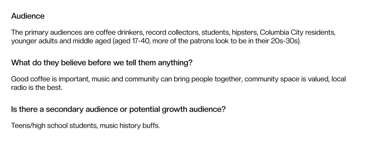
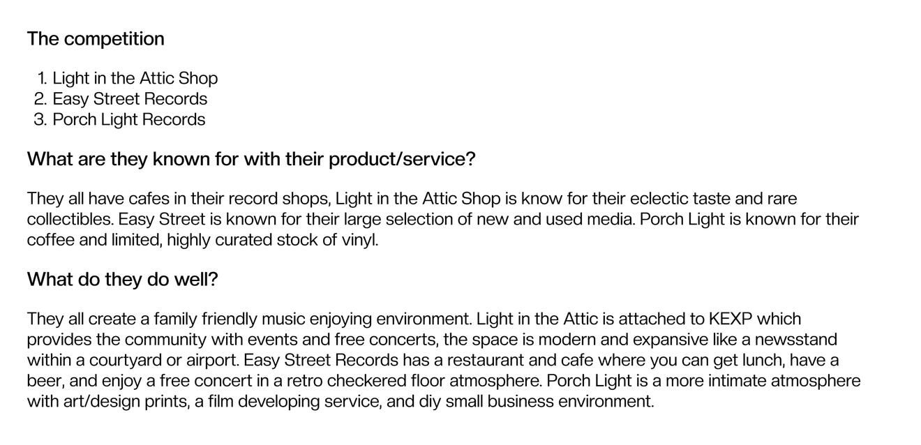
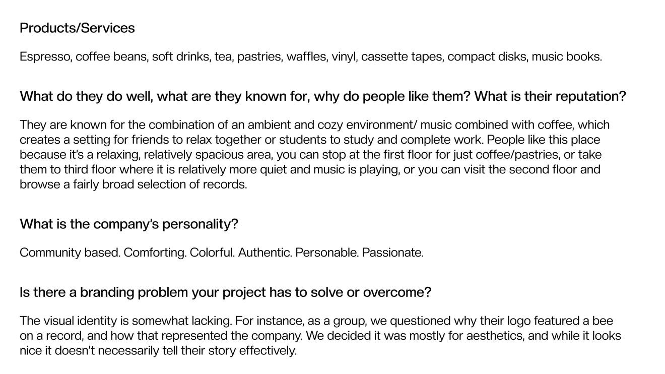
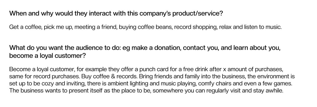
Research and Demographic
Process

Defining the brand

Authentic moodboard

Curated moodboard

Community driven moodboard

Concept board


Logo Process


Insight
We visited Empire and took notes of both the physical space and the people within it. The two halves of the identity are coffee and records, which have a similarity of both coffee beans and vinyl records being round. This shared characteristic helped inform the creation of the logo and visual tone for the rest of the brand.
Final Logos

Primary Logo

Secondary Logo

Tertiary Logo

Roasters sub-logo

Roasters sub-logo


Brand Illustrations

To go cup

Classic espresso brewer

Branded mug

Espresso bean

Record

Music note 1

Music note 2

Music note 3

Music note 4


Deliverables

Punch cards

Sandwich board

Social media ad

To go cup

Roasters mug

Records mug

Roasters t-shirt (front)
Roasters t-shirt back
Records t-shirt (front)
Records t-shirt (back)

Logo animation gif


Final Brand Book Mockups


Timeframe
6 weeks
Collaborators
Olivia Chasse (illustration, packaging)
Roles
Packaging designer, visual designer, production
Tools
Adobe Illustrator, Adobe Photoshop, Adobe After Effects, Procreate, Figma
Overview
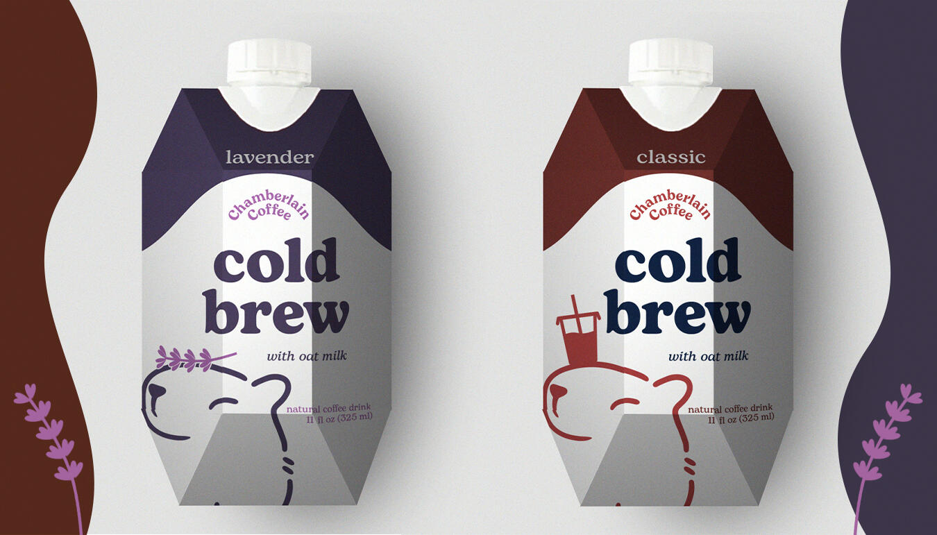
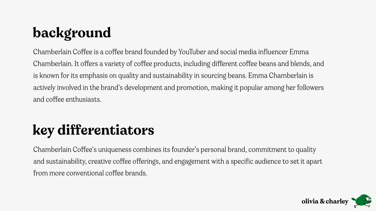
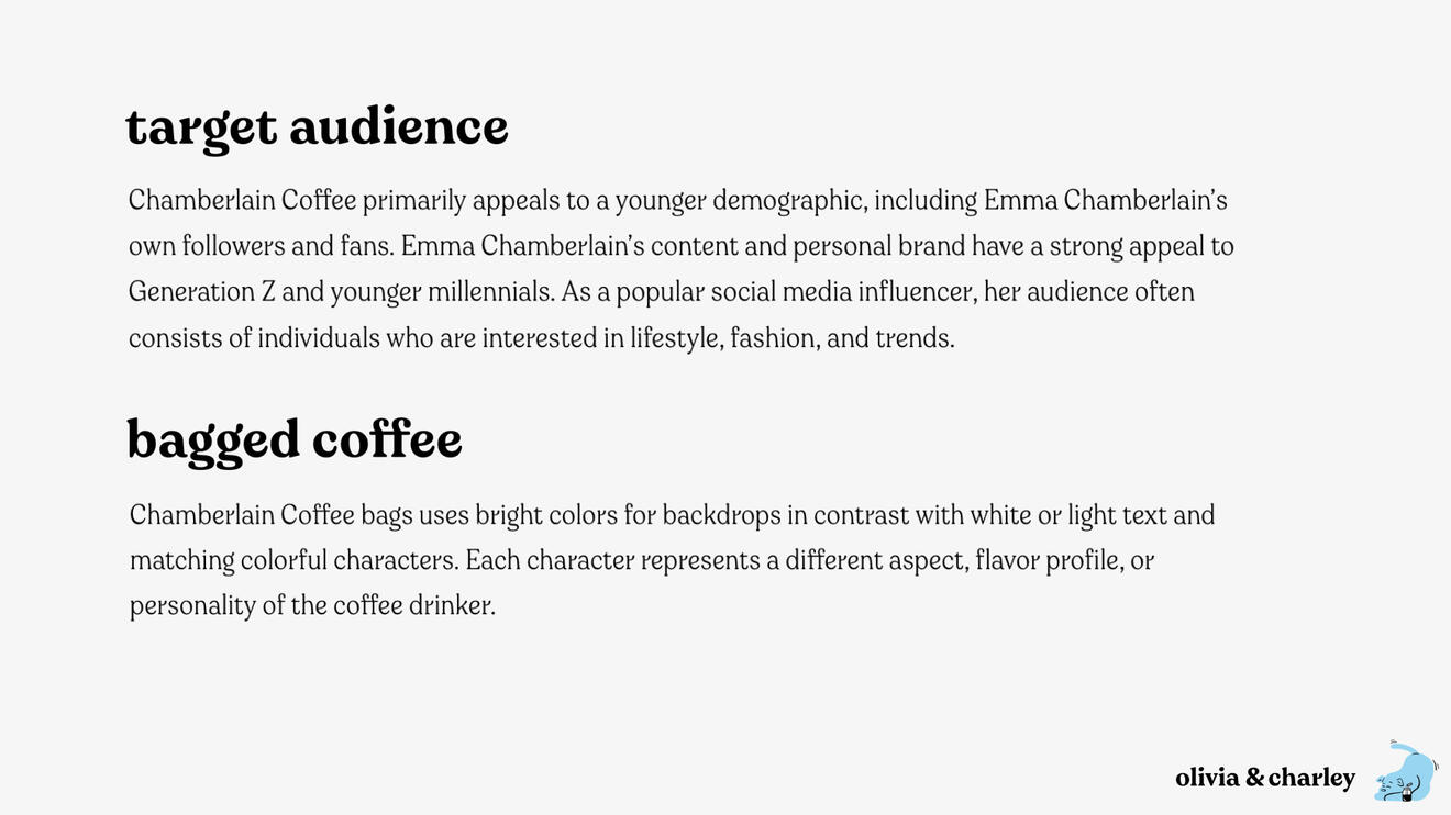
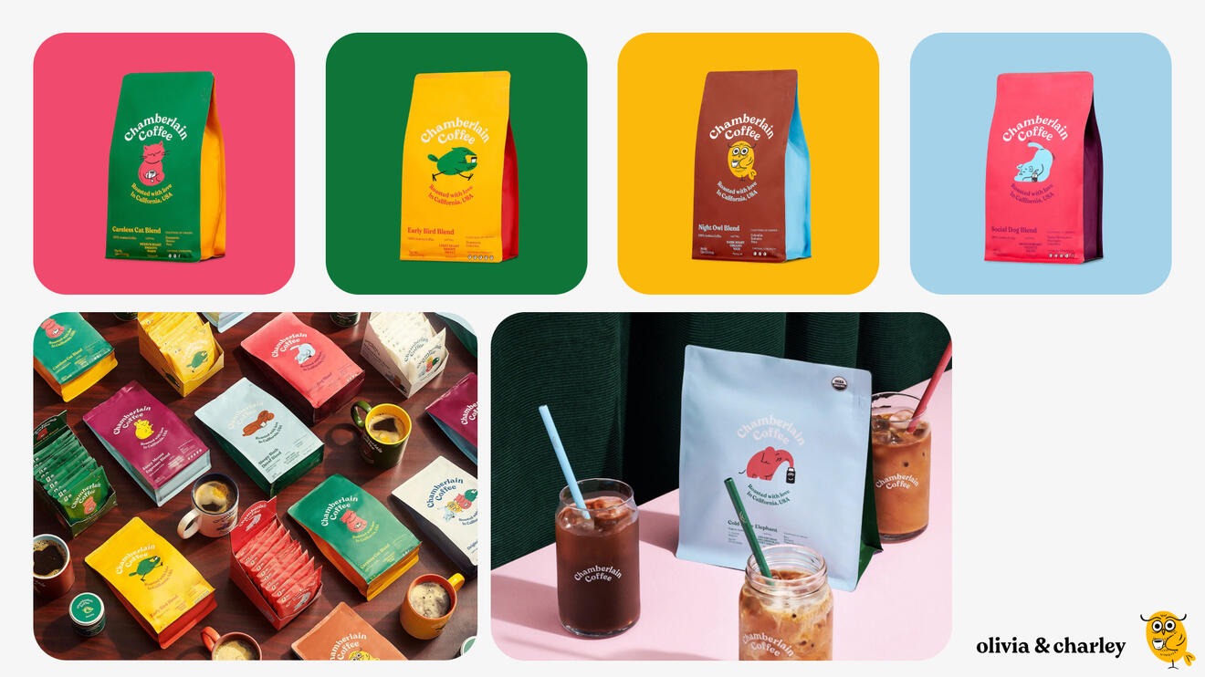
Chamberlain Coffee currently offers coffee beans and a couple of RTD (ready to drink) iced lattes. With more and more people on the go, and higher out-of-home coffee consumption, Chamberlain Coffee is looking to expand and connect with consumers in the on-the-go context by launching a new line of single-serve RTD iced coffee offerings.
Problem to Solve
Creating a sub-brand of ready to drink coffees under the Chamberlain Coffee brand which works both as a stand-alone line and within the whole brand family.
Solution
We created a novel, accessible RTD sub-brand for Chamberlain coffee that meshes well with their main brand while still standing out as its own unique line in custom packaging.
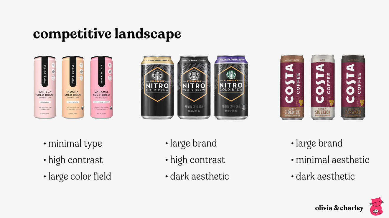
Research and Demographic
We looked at Chamberlain Coffee’s pre-existing RTD line and their other product offerings and saw their RTD drinks were offered in a can. With the benefit of RTD coffees being the ability to take it on the go, it informed our decision to design our line in a capped carton to further differentiate the sub-brand and add the resealable value.
Moodboards

Concept 1

Concept 2

Concept 3


Custom Dieline
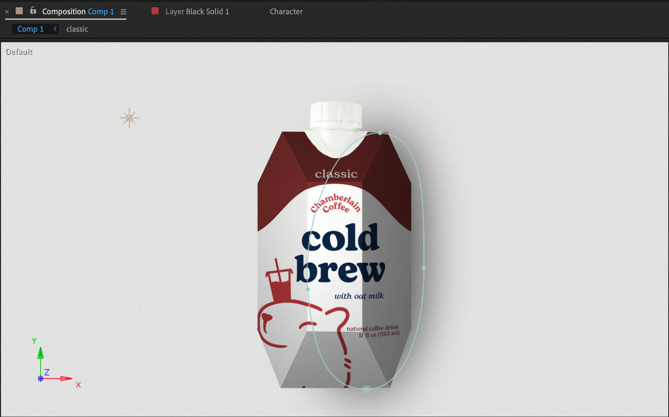
After searching online and being unable to find a dieline for a resealable carton, we decided to make one ourselves. We bought another RTD brand which utilizes resealable cartons, and carefully unfolded and measured it. These measurements were then taken into Adobe Illustrator to create a custom dieline.


Custom Mockups
Due to the fact that our dielines were custom made, we could not find a mockup to fit our packaging. This meant we also had to custom make a mockup as well. This mockup was made in Adobe After Effects using 3D layers and lighting layers as neither of us had access to or knowledge of how to use 3D programs.
Final Mockups


Timeframe
10 weeks
Roles
Motion Designer
Tools
Adobe After Effects, Adobe Illustrator
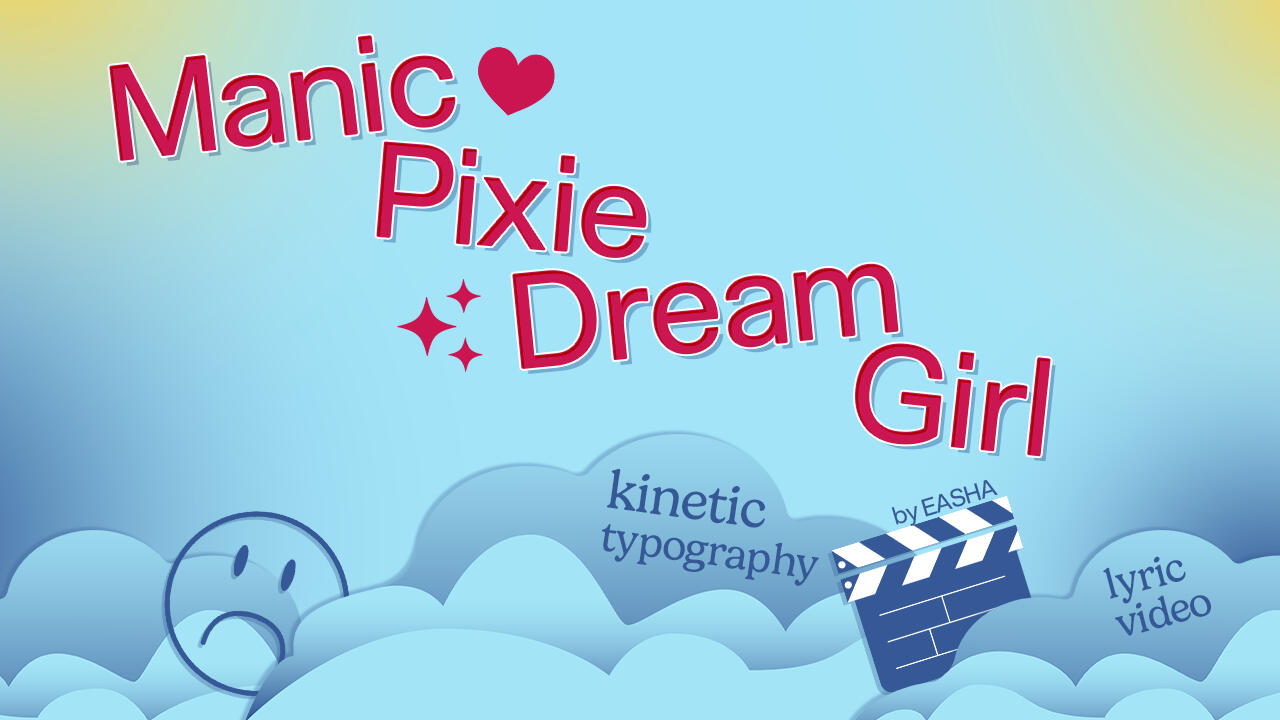
Overview
Manic Pixie Dream Girl by EASHA follows the story of the narrator meeting someone who develops into a love interest, and the persona she has to play to upkeep the relationship. The song details the ups and downs of the relationship, as well as the role she fills and the red flags she ignores for the sake of being in love with someone.
Problem to Solve
The song Manic Pixie Dream Girl by EASHA doesn’t have a lyric video.
Solution
I created a visually compelling lyric video that brings the viewer through the story told within the song by breaking it into distinctive visual parts and using kinetic typography to convey the emotion of the song with simple vector imagery to assist in the lyrics’s meanings.
Research and Insights
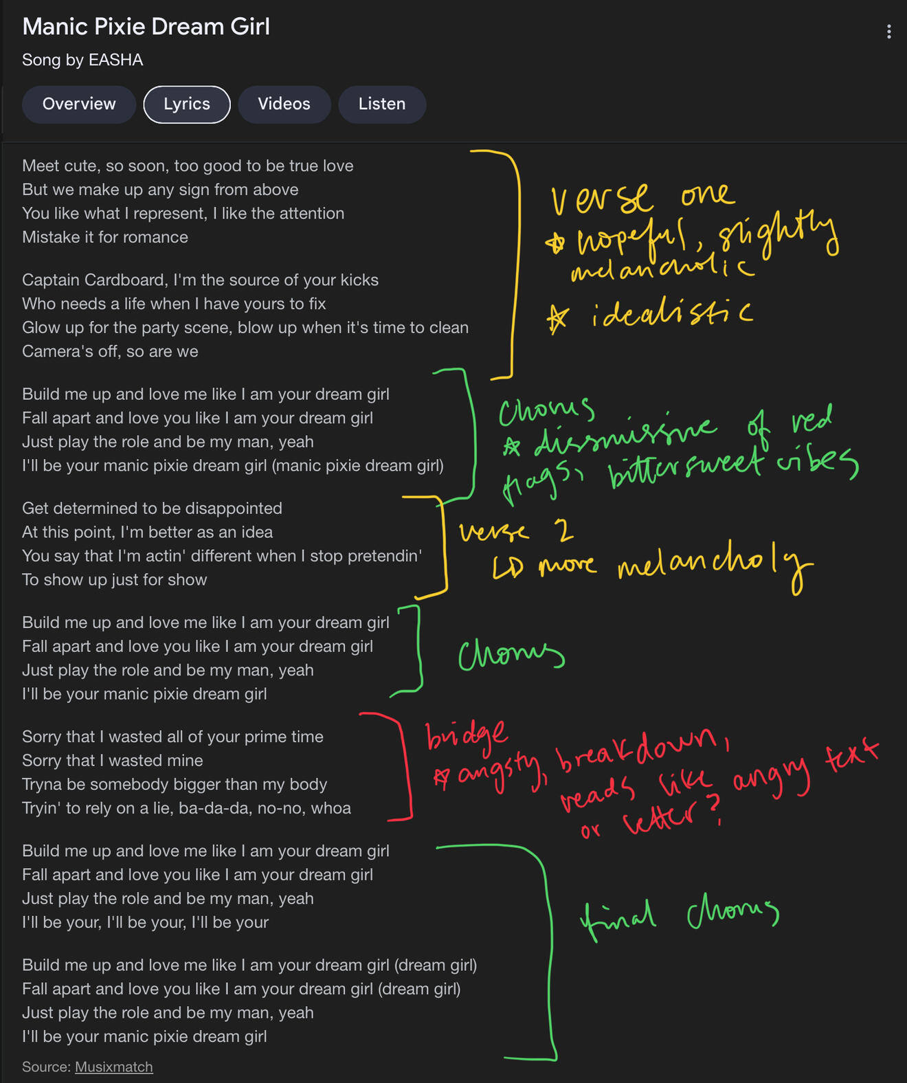
I listened to the song multiple times and realized there was a definitive tone shift in EASHA’s voice from the verses and chorus to the bridge. This shift in vocals influenced my decision to break the video up visually according to the part of the song that was playing.
The beginning of the song is more hopeful as the singer talks about the beginning stages of the relationship, so the color scheme is bright and paired with a simple sans serif to match. The chorus is cheerful with melancholy undertones as the singer starts to gloss over the more undesirable aspects of the relationship popping up, so the color scheme used has a couple darker hues paired with Valentine’s Day-inspired colors and a more expressive serif typeface. The bridge is chalked full of emotion as the narrator sings about the hardest aspects of the relationship, so the palette is dark and bold and paired with a variable weight serif font to reflect this change of emotion.

Process
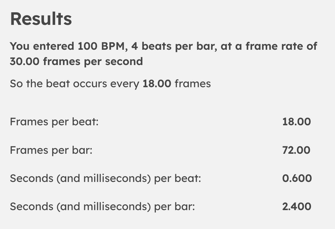
I wanted a way to keep viewers engaged and visually stimulated for the entire duration of the video, even during the slower or instrumental parts. The way I decided to do this was adding pops of color in the background on beat with the song. Using an online BPM detector, I found that the song had a BPM of 100. My video was edited at a frame rate of 30 FPS, so using an online calculator told me that every 18 frames was 1 beat. I used this calculation to put a marker in my timeline for adding a pop of color on every other beat, or every 36 frames (give or take).

I also created simple, vector images to add flare to the video and emphasize the meaning of some lyrics.


Final Video
Final Video
Timeframe
10 weeks
Roles
Layout designer, Visual Designer, Illustrator
Tools
Procreate, Adobe Illustrator, Adobe Photoshop
Overview
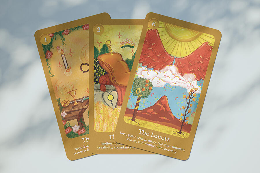
The deck's concept was to remove the imagery of human bodies from the cards so that any reader, regardless of how they look, may see themselves in the card occupying the space. It was also meant to be accessible to new readers by adding brief blurbs at the bottom of the cards with the meanings.
Problem to Solve
Tarot cards are often intimidating to people interested in beginning to read them and frequently need more representation within the art.
Solution
I created an approachable proof of concept for a tarot deck, which allows any reader to feel represented in the cards and helps new readers feel less intimidated to start reading cards.
Research and Demographic

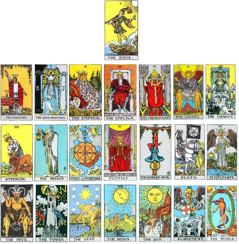
Cards from the Raider Waite-Smith tarot deck

Cards from the Tarot de Marseille deck

Cards from Aleister Crowley's Thoth Deck


Insight
Many tarot cards have important imagery adjacent to or working around a person central to the card, which informed the decision to leave space that implied a human could occupy that space. This way, the symbolism key to the card could still be present while allowing any potential reader to see themselves occupying that space. Additionally, beginner-friendly tarot decks will use a handbook of card meanings to help the reader learn, which informs the decision to bring that information in a more condensed version on the bottom of the cards.
Sketches

Final Cards

0: The Fool

1: The Magician

2: The High Priestess

3: The Empress

4: The Emperor

5: The Heirophant

6: The Lovers

7: The Chariot

8: Strength

9: The Hermit

Card back


Animated Versions